For this project the goal was to craft a standout branding and marketing strategy for the
web series “Decode” the brand creates digital web series that aims to
demystify a spectrum of topics, including, career, challenges, societal issues, relationships, and personal growth, through insightful and
thought provoking panel discussions.
I was in charge of the branding strategy and my partner Prachi Varia was in charge of the marketing strategy.

After the research and the sketching
phase the First inspiration for the
creation of the logo was the sunrise
as a symbol of a new beginning after
dealing with a lot of changes in life.
The Second inspiration for the
creation of the logo is the language
as the form of sound waves that
multiply as a form to symbolize how
inspiring are the discussions.
The third inspiration is a growing
community that begin with one
person and is multiplying with time.
Mundial is the primary font due to
its balanced proportions, elegant
curves, and legibility make it an
excellent choice for conveying
professionalism and sophistication
while remaining approachable and
easy to read.
Avenir is the secondary font cause is
clean and modern aesthetic, which
aligns well with the contemporary
nature of our brand and the content
we produce.


We chose emerald green and gold as
our brand colors because they evoke
qualities of sophistication, luxury, and
growth.
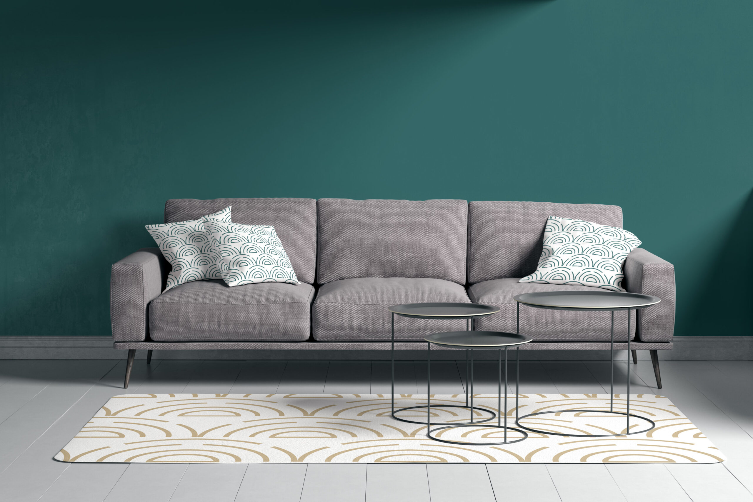
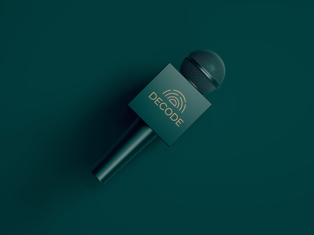
Mockups


